About the project
Atados is Brazil's largest social engagement network, connecting people, NGOs, and companies to the social sector.
This project focused on improving the volunteer opportunity creation flow: making the process clearer for NGOs, ensuring they understood their responsibilities before publishing a listing, and better structuring the information collected.
The challenge
Creating a volunteer opportunity involves several decisions (responsibilities, description, categorization) but NGOs creating a listing for the first time had no clarity on:
- what was expected of them, legally and operationally
- how long the process would take
- how their choices would affect volunteer matching
Research and insights
I talked to NGOs and volunteers to understand where language and structure were creating unnecessary effort. Testing the quiz revealed a potential UX risk I had not anticipated: an incorrect answer could frustrate NGO staff by making them think they could not continue creating a volunteer opportunity.
The original research synthesis, written in Portuguese, documented this risk alongside three flow requirements: auto-save, a back button and a progress bar.
This led me to validate a core requirement with the team: any solution needed auto-save and a back button on every page, so users would never lose progress from getting an answer wrong.
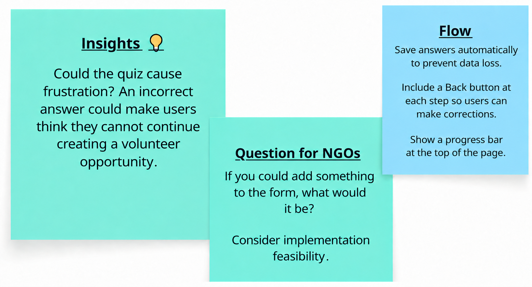
Research notes: a potential quiz-related frustration risk, a question for NGOs and requirements for preserving progress.
View original artifact ↗Read the image text
Insights. Could the quiz cause frustration? An incorrect answer could make users think they cannot continue creating a volunteer opportunity. Question for NGOs: if you could add something to the form, what would it be? Consider implementation feasibility. Flow: save answers automatically to prevent data loss; include a Back button at each step so users can make corrections; show a progress bar at the top of the page.
Prioritizing what to build (RICE)
Since there was more than one possible solution to reduce errors during listing creation, I used the RICE framework (Reach, Impact, Confidence, Effort) to prioritize between them. In this case, evaluating the viability of an explanatory video pop-up before listing creation.
- Reach: low-medium — mainly affects NGOs creating a listing for the first time
- Impact: medium — reduces risk of poorly filled listings and compliance issues
- Confidence: high — supported by the research findings, PRD scenarios, and wireframe review with the team.
- Effort: low — about 1 month, involving pop-up front-end + video player + light backend
RICE prioritization table (original artifact in Portuguese): Reach, Impact, Confidence, and Effort scores used to justify the pop-up solution to the team.
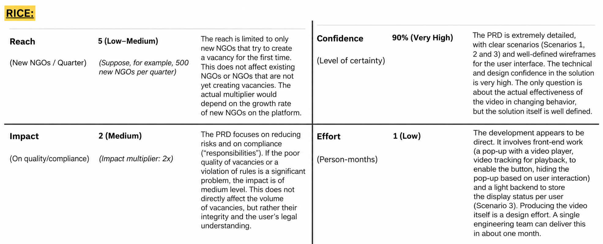
RICE comparison with the original assumptions, scores and rationale.
View original artifact ↗Read the image text
RICE. Reach: 5, low–medium; new NGOs per quarter. Hypothetical example: 500 new NGOs per quarter. Reach is limited to new NGOs creating an opportunity for the first time. It does not affect existing NGOs or those not yet creating opportunities. The actual multiplier would depend on the platform’s new-NGO growth rate. Impact: 2, medium; quality/compliance, impact multiplier 2x. The PRD focuses on reducing risks and clarifying responsibilities. If low-quality listings or rule violations are a significant problem, impact is medium. This affects listing integrity and users’ legal understanding rather than the volume of opportunities. Confidence: 90%, very high; level of certainty. The PRD has detailed scenarios 1, 2 and 3 and well-defined interface wireframes. Technical and design confidence in the solution is high. Uncertainty remains about whether the video changes behavior, although the solution is clearly defined. Effort: 1, low; person-months. Work includes front-end for the video pop-up, playback tracking to enable the button, hiding the pop-up based on interaction, and a light backend storing per-user viewing status, scenario 3. Video production itself is a design effort. One engineering team could deliver the implementation in about a month.
Defining the pop-up flow (PRD)
For the chosen solution (a pop-up with a short video explaining the NGO's responsibilities before creating a listing) I wrote a PRD with Given/When/Then scenarios, covering:
- First view: the pop-up opens automatically, with the confirmation button disabled.
- Button activation: the "I've read and agree to the responsibilities" button only becomes clickable once the video ends (or reaches 90%).
- Persistence: once confirmed, the pop-up no longer appears automatically (but stays accessible via a "Help" link).
PRD scenarios in Given/When/Then format (original artifact in Portuguese), covering first view, button activation, and pop-up persistence.
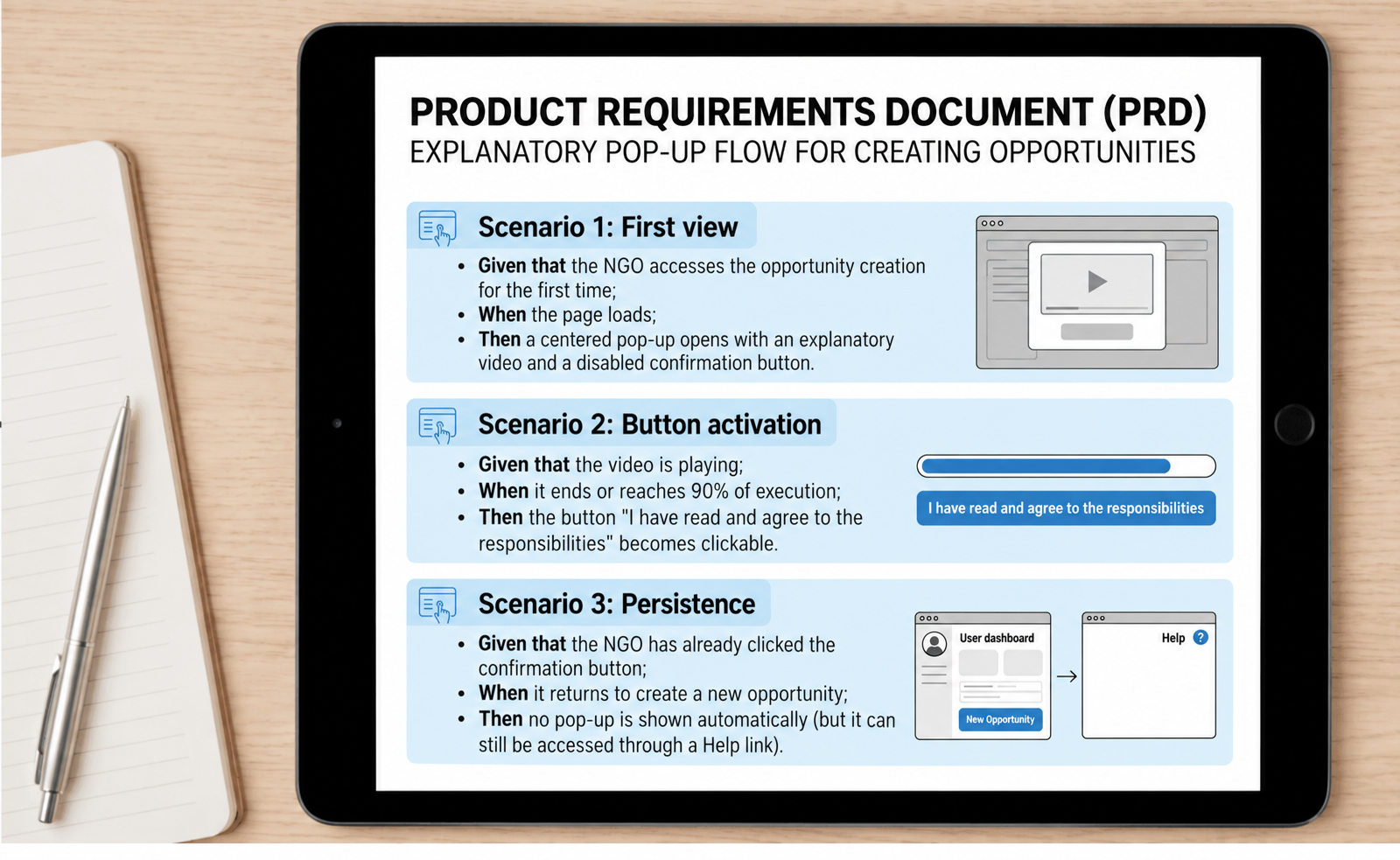
PRD visual summary: first view, button activation and persistence.
View original artifact ↗Read the image text
Product requirements document: explanatory pop-up flow for creating opportunities. Scenario 1, first view: Given the NGO accesses opportunity creation for the first time; when the page loads; then a centered pop-up opens with an explanatory video and disabled confirmation. Scenario 2, button activation: Given the video is playing; when it ends or reaches 90%; then I have read and agree to the responsibilities becomes clickable. Scenario 3, persistence: Given the NGO already confirmed; when it returns to create another opportunity; then the pop-up no longer opens automatically, but remains available through Help. Diagram labels: user dashboard, new opportunity, help.
Pop-up wireframes
I designed the visual progression of the pop-up's three states: overlay with a clear title, disabled button during the video, and enabled button once it ends.
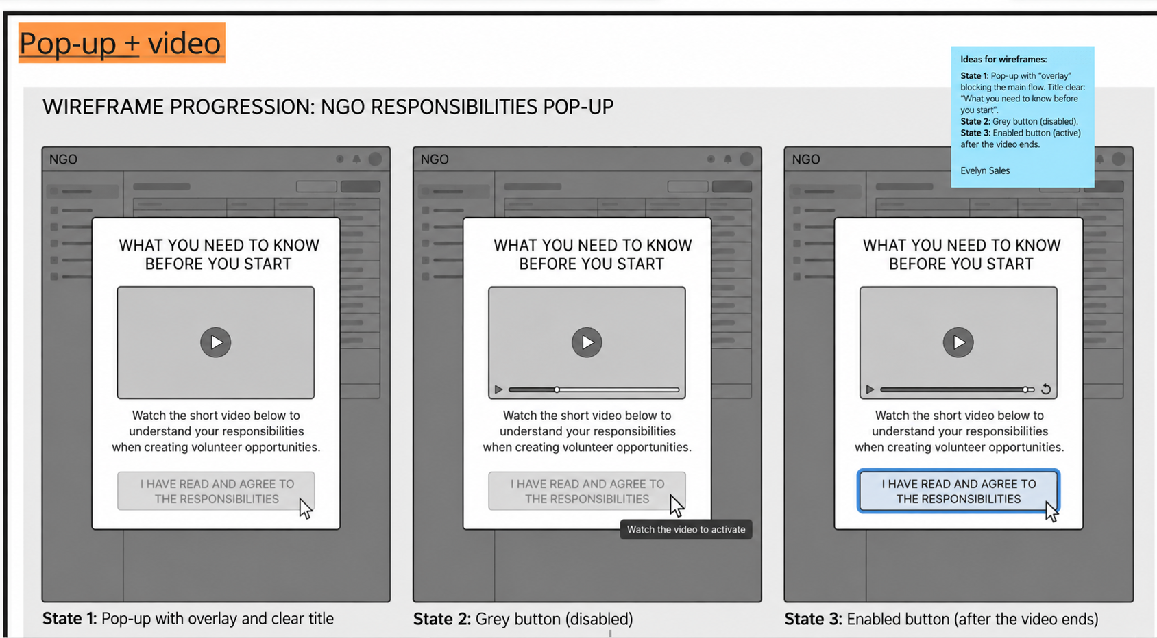
Responsibilities pop-up: overlay, disabled button and enabled button.
View original artifact ↗Read the image text
Pop-up + video. Wireframe progression: NGO responsibilities pop-up. What you need to know before you start. Watch the short video below to understand your responsibilities when creating opportunities. I have read and agree to the responsibilities. Watch the video to activate. State 1: overlay and clear title. State 2: grey, disabled button. State 3: enabled button after the video ends. Wireframe ideas: the overlay blocks the background; the title explains what users need to know before starting; the button stays disabled until the end. Evelyn Sales.
Accessibility and QA checklist
I documented full specs for desktop and mobile, including accessibility requirements that apply across devices:
- Captions required on the video
- Confirmation button compatible with screen readers (ARIA labels)
- Video hosted externally so it doesn't impact page load performance
- Clicking outside the pop-up does NOT close it (viewing is mandatory)
Accessibility and QA checklist (original artifact in Portuguese) for desktop and mobile: captions, screen-reader compatibility, load performance, and mandatory viewing behavior.
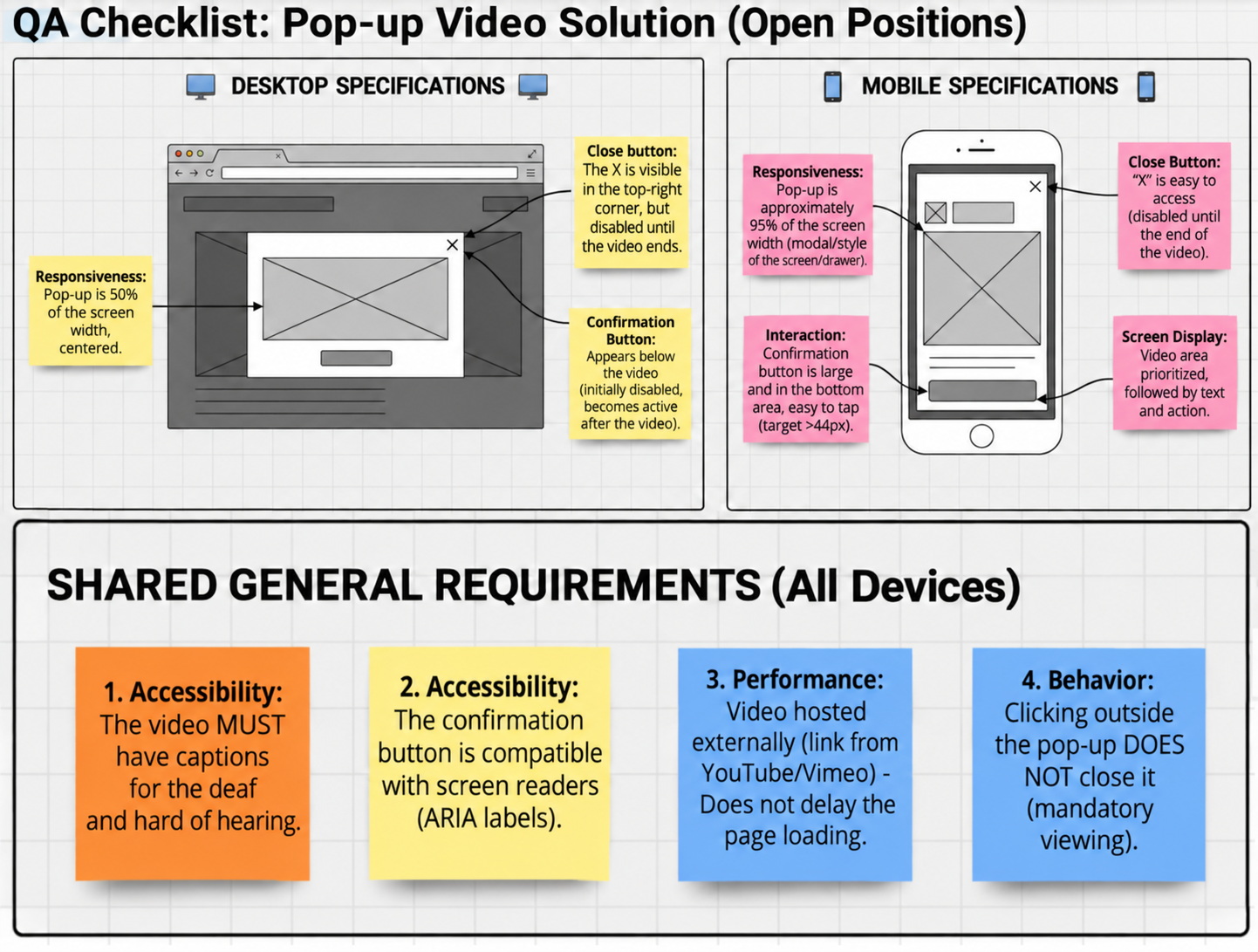
Desktop and mobile specifications and shared accessibility requirements.
View original artifact ↗Read the image text
QA checklist: audiovisual pop-up for NGO opportunities. Desktop: centered pop-up at 50% width. Close X is visible in the top-right corner but disabled until the video ends. Confirmation appears below the video, initially disabled and then enabled. Mobile: pop-up covers about 95% of screen width in a modal/drawer layout. Close X is easy to reach but disabled until the video ends. Large confirmation button at the bottom, touch target greater than 44px. Video area is prioritized, followed by text and action. Shared requirements: 1. Video must have captions for deaf and hard-of-hearing users. 2. Confirmation supports screen readers with ARIA labels. 3. Video is hosted externally, YouTube/Vimeo, to avoid delaying page loading. 4. Clicking outside does not close the pop-up: viewing is mandatory in this documented proposal.
Accessibility reflection
One decision I would revisit in a future iteration is mandatory video viewing.
Although the intention was to make sure NGOs understood their responsibilities before creating a listing, requiring users to complete a video before proceeding may create an additional barrier.
I would test alternative ways of communicating the same information (including accessible text, captions, and an option to review the information at the user's own pace) before deciding whether mandatory viewing is appropriate.
Testing CTA visual consistency
I also tested variations of the call-to-action button on the listing-creation screen, comparing the current version against two alternatives: one keeping the existing color palette, and one with a highlighted (contrasting) button, tested on both desktop and mobile.
CTA button test (original artifact in Portuguese): current version vs. same-palette vs. highlighted button, compared across desktop and mobile.
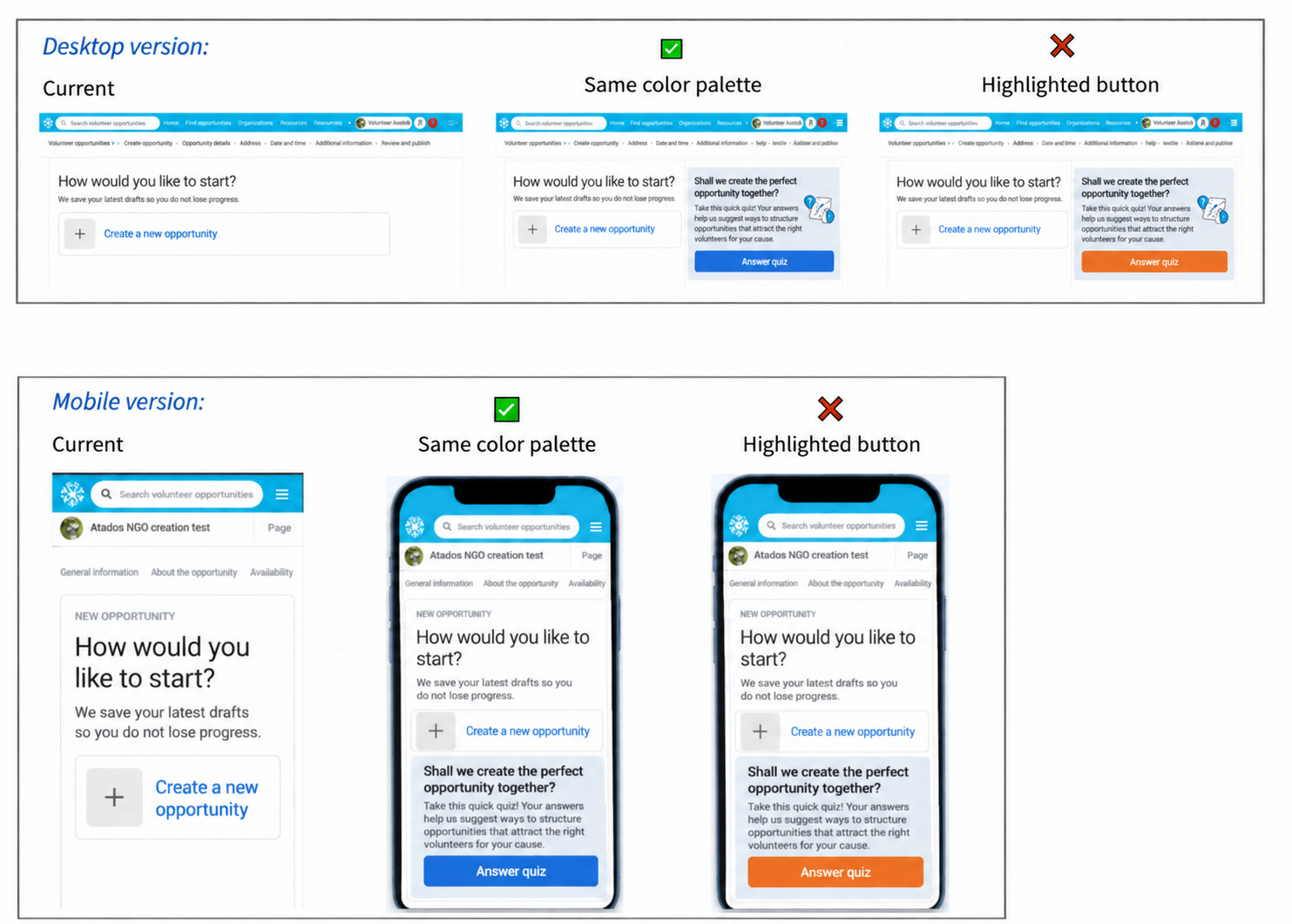
CTA comparison: current version, same palette and contrasting button.
View original artifact ↗Read the image text
Desktop and mobile versions. Current version; same color palette, marked with a check; highlighted button, marked with a cross. How would you like to start? We save your latest drafts so you do not lose progress. Create a new opportunity. Shall we create the perfect opportunity together? Take this quick quiz: your answers help us suggest how to structure opportunities that attract the right volunteers for your cause. Answer quiz. Search volunteer opportunities. Atados NGO creation test. General information; about the opportunity; availability.
Structuring the quiz
The introductory quiz went through iterative planning with the team, including applying Atados' visual identity to the prototype and defining how responses would be saved (evaluating integration with the existing form).
Planning board (original artifact in Portuguese) for the introductory quiz, including the visual identity applied to the interactive prototype.
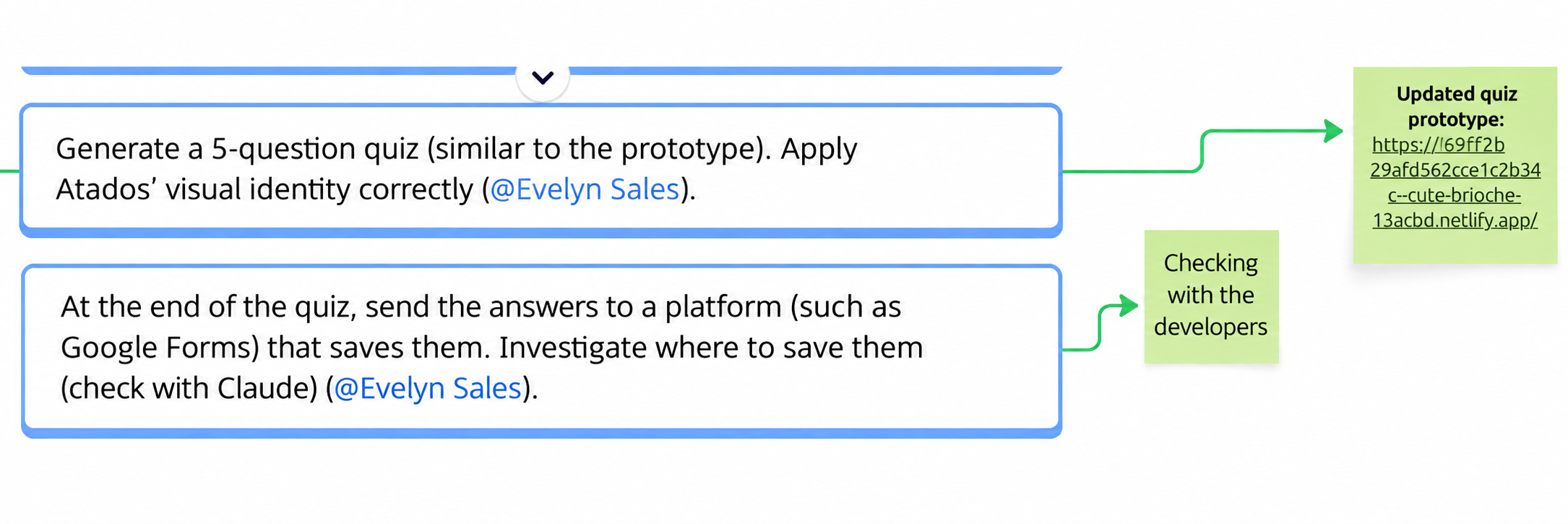
Quiz planning: five questions, visual identity and response storage.
View original artifact ↗Read the image text
Generate a quiz with five questions, similar to the prototype, and apply Atados’ visual identity correctly. Assigned to Evelyn Sales. At the end, send the answers to a platform such as Google Forms that saves them. Investigate where responses can be stored and check with Claude. Assigned to Evelyn Sales. Notes: checking with developers; updated quiz prototype. The original prototype URL remains visible in the original artifact.
Outcome
The project resulted in a structured set of product and design recommendations, including prioritization, PRD requirements, interaction specifications, and accessibility and QA criteria.
Because this work did not include post-launch measurement, I would validate next whether these changes reduce abandonment, prevent lost progress, and improve completion of the listing flow.
What I'd validate next
- Whether the video's estimated viewing time matches actual behavior
- Whether the highlighted button increases conversion without breaking visual identity
- Whether the quiz reduces — rather than increases — abandonment
- Whether auto-save eliminates lost-progress complaints
Role: UX/UI Design Volunteer
Timeline: March–August 2026
Methods: User Research · RICE Prioritization · PRD Writing · Wireframing · Interaction Design · UX Writing · Accessibility QA
Thank you for exploring this project! I’d love to connect and discuss how I could contribute to your team.