Atados
Making NGO onboarding clearer and more accessible through UX Writing, research, and transparent interactions.
My role: UX/ UI Design Volunteer
I contributed to: UX Research · UX Writing · Interaction Design · Wireframing · Accessibility · Product Priorization
Date: March to August 2026 (5 months)
The three states of the responsibilities pop-up: disabled while the video plays, enabled once it ends. Labels are in Portuguese, the language used with the local team.
About the project
Atados is Brazil's largest social engagement network, connecting people, NGOs, and companies to the social sector.
This project focused on improving the volunteer opportunity creation flow: making the process clearer for NGOs, ensuring they understood their responsibilities before publishing a listing, and better structuring the information collected.
The challenge
Creating a volunteer opportunity involves several decisions (responsibilities, description, categorization) but NGOs creating a listing for the first time had no clarity on:
what was expected of them, legally and operationally
how long the process would take
how their choices would affect volunteer matching
Research and insights
I talked to NGOs and volunteers to understand where language and structure were creating unnecessary effort. A key insight came from directly testing the quiz: the quiz itself could create frustration if an NGO got answers "wrong" and felt unqualified to continue creating the listing (a UX risk I hadn't anticipated at first).
Research synthesis (in Portuguese): key insight was that the quiz itself could frustrate NGOs who got answers "wrong," plus flow requirements. Auto-save, back button, progress bar.
This led me to validate a core requirement with the team: any solution needed auto-save and a back button on every page, so users would never lose progress from getting an answer wrong.
Prioritizing what to build (RICE)
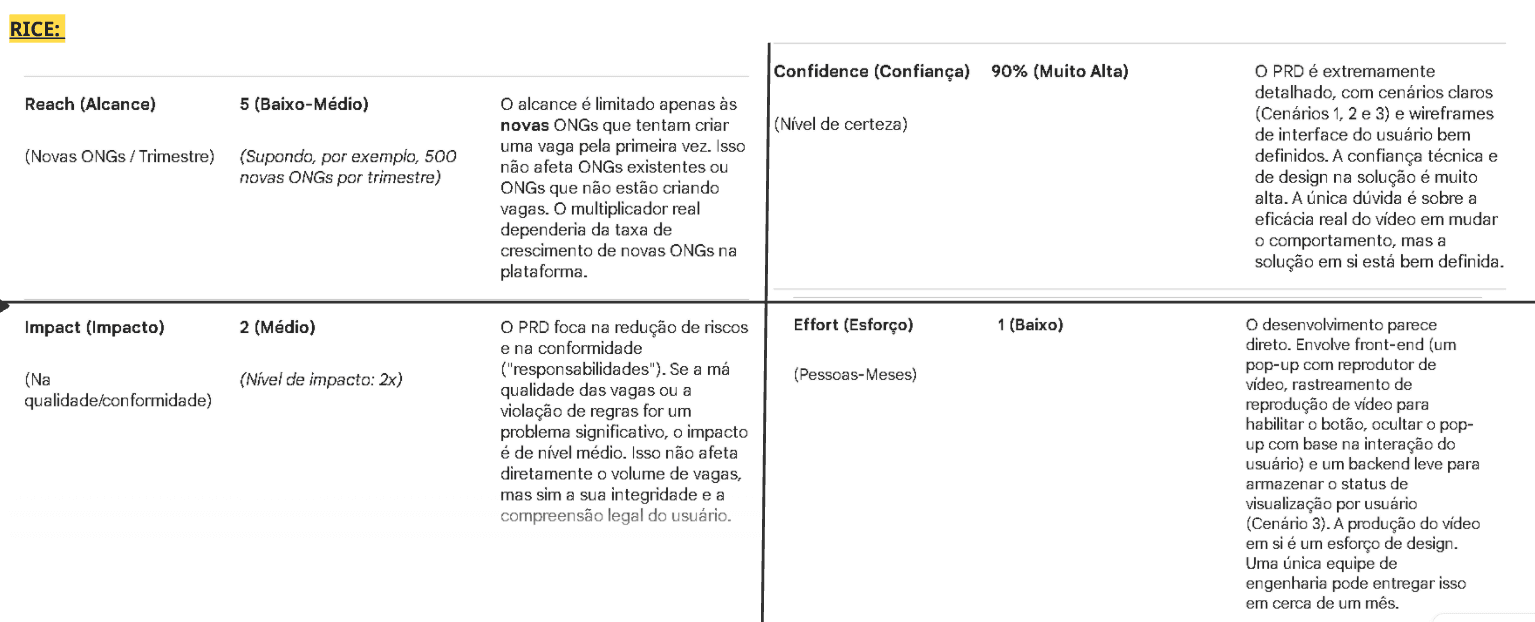
Since there was more than one possible solution to reduce errors during listing creation, I used the RICE framework (Reach, Impact, Confidence, Effort) to prioritize between them. In this case, evaluating the viability of an explanatory video pop-up before listing creation.
Reach: low-medium — mainly affects NGOs creating a listing for the first time
Impact: medium — reduces risk of poorly filled listings and compliance issues
Confidence: 90% (high) — detailed PRD, scenarios, and wireframes already validated
Effort: low — about 1 month, involving pop-up front-end + video player + light backend
RICE prioritization table (in Portuguese): Reach, Impact, Confidence, and Effort scores used to justify the pop-up solution to the team.
Defining the pop-up flow (PRD)
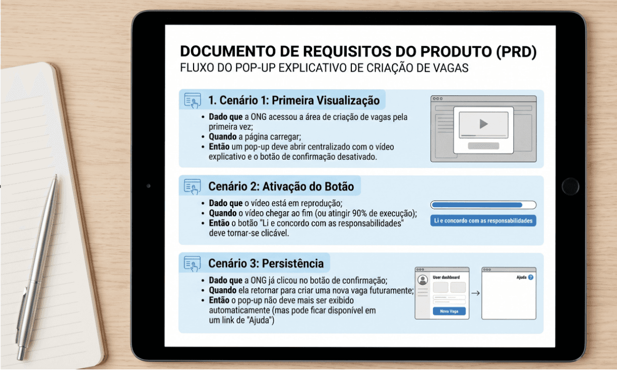
For the chosen solution (a pop-up with a short video explaining the NGO's responsibilities before creating a listing) I wrote a PRD with Given/When/Then scenarios, covering:
First view: the pop-up opens automatically, with the confirmation button disabled.
Button activation: the "I've read and agree to the responsibilities" button only becomes clickable once the video ends (or reaches 90%).
Persistence: once confirmed, the pop-up no longer appears automatically (but stays accessible via a "Help" link).
PRD scenarios in Given/When/Then format (in Portuguese), covering first view, button activation, and pop-up persistence.
Pop-up wireframes
I designed the visual progression of the pop-up's three states: overlay with a clear title, disabled button during the video, and enabled button once it ends.
Accessibility and QA checklist
I documented full specs for desktop and mobile, including accessibility requirements that apply across devices:
Captions required on the video
Confirmation button compatible with screen readers (ARIA labels)
Video hosted externally so it doesn't impact page load performance
Clicking outside the pop-up does NOT close it (viewing is mandatory)
Accessibility and QA checklist (in Portuguese) for desktop and mobile: captions, screen-reader compatibility, load performance, and mandatory viewing behavior.
Testing CTA visual consistency
I also tested variations of the call-to-action button on the listing-creation screen, comparing the current version against two alternatives: one keeping the existing color palette, and one with a highlighted (contrasting) button, tested on both desktop and mobile.
CTA button test (in Portuguese): current version vs. same-palette vs. highlighted button, compared across desktop and mobile.
Structuring the quiz
The introductory quiz went through iterative planning with the team, including applying Atados' visual identity to the prototype and defining how responses would be saved (evaluating integration with the existing form).
Planning board (in Portuguese) for the introductory quiz, including the visual identity applied to the interactive prototype.
Outcome
The project resulted in a set of well-grounded product and design decisions.
Not just wireframes, but prioritization (RICE), structured requirements (PRD), and testable acceptance criteria (QA/accessibility). It pushed me to think beyond the screen: how to justify, specify, and validate a solution end to end.
What I'd validate next
Whether the video's estimated viewing time matches actual behavior
Whether the highlighted button increases conversion without breaking visual identity
Whether the quiz reduces — rather than increases — abandonment
Whether auto-save eliminates lost-progress complaints
Role: UX/UI Design Volunteer
Timeline: March–August 2026
Methods: User Research · RICE Prioritization · PRD Writing · Wireframing · Interaction Design · UX Writing · Accessibility QA
Thank you for exploring this project! I’d love to connect and discuss how I could contribute to your team.
Atados
Making NGO onboarding clearer and more accessible through UX Writing, research, and transparent interactions.
My role:
UX/ UI Design Volunteer
I contributed to:
UX Research · UX Writing · Interaction Design · Wireframing · Accessibility · Product Priorization
Date:
March to August 2026 (5 months)
The three states of the responsibilities pop-up: disabled while the video plays, enabled once it ends. Labels are in Portuguese, the language used with the local team.
About the project
Atados is Brazil's largest social engagement network, connecting people, NGOs, and companies to the social sector.
This project focused on improving the volunteer opportunity creation flow: making the process clearer for NGOs, ensuring they understood their responsibilities before publishing a listing, and better structuring the information collected.
The challenge
Creating a volunteer opportunity involves several decisions (responsibilities, description, categorization) but NGOs creating a listing for the first time had no clarity on:
what was expected of them, legally and operationally
how long the process would take
how their choices would affect volunteer matching
Research and insights
I talked to NGOs and volunteers to understand where language and structure were creating unnecessary effort. A key insight came from directly testing the quiz: the quiz itself could create frustration if an NGO got answers "wrong" and felt unqualified to continue creating the listing (a UX risk I hadn't anticipated at first).
Research synthesis (in Portuguese): key insight was that the quiz itself could frustrate NGOs who got answers "wrong," plus flow requirements. Auto-save, back button, progress bar.
This led me to validate a core requirement with the team: any solution needed auto-save and a back button on every page, so users would never lose progress from getting an answer wrong.
Prioritizing what to build (RICE)
Since there was more than one possible solution to reduce errors during listing creation, I used the RICE framework (Reach, Impact, Confidence, Effort) to prioritize between them. In this case, evaluating the viability of an explanatory video pop-up before listing creation.
Reach: low-medium — mainly affects NGOs creating a listing for the first time
Impact: medium — reduces risk of poorly filled listings and compliance issues
Confidence: 90% (high) — detailed PRD, scenarios, and wireframes already validated
Effort: low — about 1 month, involving pop-up front-end + video player + light backend
RICE prioritization table (in Portuguese): Reach, Impact, Confidence, and Effort scores used to justify the pop-up solution to the team.
Defining the pop-up flow (PRD)
For the chosen solution (a pop-up with a short video explaining the NGO's responsibilities before creating a listing) I wrote a PRD with Given/When/Then scenarios, covering:
First view: the pop-up opens automatically, with the confirmation button disabled.
Button activation: the "I've read and agree to the responsibilities" button only becomes clickable once the video ends (or reaches 90%).
Persistence: once confirmed, the pop-up no longer appears automatically (but stays accessible via a "Help" link).
PRD scenarios in Given/When/Then format (in Portuguese), covering first view, button activation, and pop-up persistence.
Pop-up wireframes
I designed the visual progression of the pop-up's three states: overlay with a clear title, disabled button during the video, and enabled button once it ends.
Accessibility and QA checklist
I documented full specs for desktop and mobile, including accessibility requirements that apply across devices:
Captions required on the video
Confirmation button compatible with screen readers (ARIA labels)
Video hosted externally so it doesn't impact page load performance
Clicking outside the pop-up does NOT close it (viewing is mandatory)
Accessibility and QA checklist (in Portuguese) for desktop and mobile: captions, screen-reader compatibility, load performance, and mandatory viewing behavior.
Testing CTA visual consistency
I also tested variations of the call-to-action button on the listing-creation screen, comparing the current version against two alternatives: one keeping the existing color palette, and one with a highlighted (contrasting) button, tested on both desktop and mobile.
CTA button test (in Portuguese): current version vs. same-palette vs. highlighted button, compared across desktop and mobile.
Structuring the quiz
The introductory quiz went through iterative planning with the team, including applying Atados' visual identity to the prototype and defining how responses would be saved (evaluating integration with the existing form).
Planning board (in Portuguese) for the introductory quiz, including the visual identity applied to the interactive prototype.
Outcome
The project resulted in a set of well-grounded product and design decisions.
Not just wireframes, but prioritization (RICE), structured requirements (PRD), and testable acceptance criteria (QA/accessibility). It pushed me to think beyond the screen: how to justify, specify, and validate a solution end to end.
What I'd validate next
Whether the video's estimated viewing time matches actual behavior
Whether the highlighted button increases conversion without breaking visual identity
Whether the quiz reduces — rather than increases — abandonment
Whether auto-save eliminates lost-progress complaints
Role: UX/UI Design Volunteer
Timeline: March–August 2026
Methods: User Research · RICE Prioritization · PRD Writing · Wireframing · Interaction Design · UX Writing · Accessibility QA
Thank you for exploring this project! I’d love to connect and discuss how I could contribute to your team.